NEW YORK CITY — Islands throughout the world are going under water. It is obvious that human induced climate change is causing the ocean temperatures to rise. The combination of rising sea levels and volatile weather produced from rising ocean temperatures is wreaking havoc across many traditional island nations. In fact, the United Nations is embarking on a mission to understand what the changes mean; however, the location of the United Nations is now looking into the mirror. The islands are going under water… but, not in slow rising water manner. Rather, some of the islands, such as Staten Island, are being slam dunked.
Climate Change And Hurricane Sandy: How Global Warming Might Have Made The Superstorm Worse
From Climate Central’s Andrew Freedman:
As officials begin the arduous task of pumping corrosive seawater out of New York City’s subway system and try to restore power to lower Manhattan, and residents of the New Jersey Shore begin to take stock of the destruction, experts and political leaders are asking what Hurricane Sandy had to do with climate change. After all, the storm struck a region that has been hit hard by several rare extreme weather events in recent years, from Hurricane Irene to “Snowtober.”
Scientists cannot yet answer the specific question of whether climate change made Hurricane Sandy more likely to occur, since such studies, known as detection and attribution research, take many months to complete. What is already clear, however, is that climate change very likely made Sandy’s impacts worse than they otherwise would have been.
There are three different ways climate change might have influenced Sandy: through the effects of sea level rise; through abnormally warm sea surface temperatures; and possibly through an unusual weather pattern that some scientists think bore the fingerprint of rapidly disappearing Arctic sea ice.
If this were a criminal case, detectives would be treating global warming as a likely accomplice in the crime.
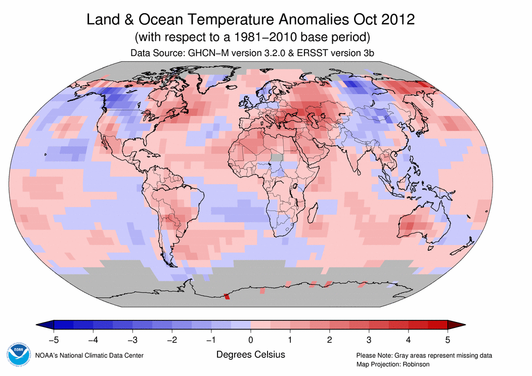
Warmer, Higher Seas
Water temperatures off the East Coast were unusually warm this summer — so much so that New England fisheries officials observed significant shifts northward in cold water fish such as cod. Sea surface temperatures off the Carolinas and Mid-Atlantic remained warm into the fall, offering an ideal energy source for Hurricane Sandy as it moved northward from the Caribbean. Typically, hurricanes cannot survive so far north during late October, since they require waters in the mid to upper 80s Fahrenheit to thrive.


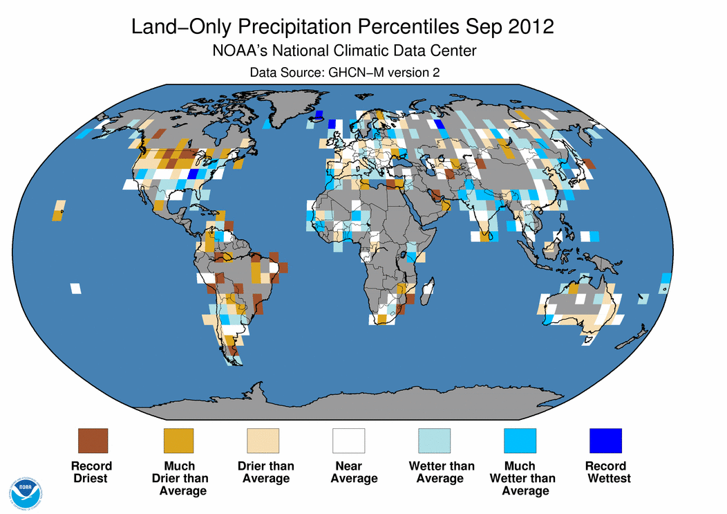
 September 2012 Selected Climate
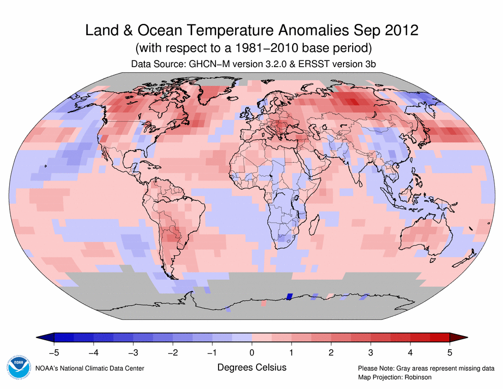


Ice Mass Loss Mounting
from NASA
Ice Mass Loss in Greenland
PASADENA, Calif. – An international team of experts supported by NASA and the European Space Agency (ESA) has combined data from multiple satellites and aircraft to produce the most comprehensive and accurate assessment to date of ice sheet losses in Greenland and Antarctica and their contributions to sea level rise.
In a landmark study published Thursday in the journal Science, 47 researchers from 26 laboratories report the combined rate of melting for the ice sheets covering Greenland and Antarctica has increased during the last 20 years. Together, these ice sheets are losing more than three times as much ice each year (equivalent to sea level rise of 0.04 inches or 0.95 millimeters) as they were in the 1990s (equivalent to 0.01 inches or 0.27 millimeters). About two-thirds of the loss is coming from Greenland, with the rest from Antarctica.
This rate of ice sheet losses falls within the range reported in 2007 by the Intergovernmental Panel on Climate Change (IPCC). The spread of estimates in the 2007 IPCC report was so broad, however, it was not clear whether Antarctica was growing or shrinking. The new estimates, which are more than twice as accurate because of the inclusion of more satellite data, confirm both Antarctica and Greenland are losing ice. Combined, melting of these ice sheets contributed 0.44 inches (11.1 millimeters) to global sea levels since 1992. This accounts for one-fifth of all sea level rise over the 20-year survey period. The remainder is caused by the thermal expansion of the warming ocean, melting of mountain glaciers and small Arctic ice caps, and groundwater mining.
The study was produced by an international collaboration — the Ice Sheet Mass Balance Inter-comparison Exercise (IMBIE) — that combined observations from 10 satellite missions to develop the first consistent measurement of polar ice sheet changes. The researchers reconciled differences among dozens of earlier ice sheet studies by carefully matching observation periods and survey areas. They also combined measurements collected by different types of satellite sensors, such as ESA’s radar missions; NASA’s Ice, Cloud and land Elevation Satellite (ICESat); and the NASA/German Aerospace Center’s Gravity Recovery and Climate Experiment (GRACE).
“What is unique about this effort is that it brought together the key scientists and all of the different methods to estimate ice loss,” said Tom Wagner, NASA’s cryosphere program manager in Washington. “It’s a major challenge they undertook, involving cutting-edge, difficult research to produce the most rigorous and detailed estimates of ice loss from Greenland and Antarctica to date. The results of this study will be invaluable in informing the IPCC as it completes the writing of its Fifth Assessment Report over the next year.”
Professor Andrew Shepherd of the University of Leeds in the United Kingdom coordinated the study, along with research scientist Erik Ivins of NASA’s Jet Propulsion Laboratory in Pasadena, Calif. Shepherd said the venture’s success is because of the cooperation of the international scientific community and the precision of various satellite sensors from multiple space agencies.
“Without these efforts, we would not be in a position to tell people with confidence how Earth’s ice sheets have changed, and to end the uncertainty that has existed for many years,” Shepherd said.
The study found variations in the pace of ice sheet change in Antarctica and Greenland.
“Both ice sheets appear to be losing more ice now than 20 years ago, but the pace of ice loss from Greenland is extraordinary, with nearly a five-fold increase since the mid-1990s,” Ivins said. “In contrast, the overall loss of ice in Antarctica has remained fairly constant, with the data suggesting a 50-percent increase in Antarctic ice loss during the last decade.”